


const RN = 'React Native';
One of the pros of using RN is it's simplified model for building cross-platform UI's. Developers can use a single codebase to generate native iOS and Android apps, allowing them to focus primarily on application code and very little on platform-specific APIs and quirks. Unfortunately this design model does not play well when it comes to event driven interactions, navigation, permissions, push notifications, and so on.
In this article, I'm going to discuss one of these challenges—building smooth event driven interactions—and a tool in the RN ecosystem, Reanimated, that helps us take on this challenge without fear. While you are still here, we'll build out a sample UI that's potentially not that useful, but showcases a lot of animation and gesture techniques we'll be developing with this new tool. To whet your appetite a bit, here's a teaser of what we'll be building:
You can find the entire code on GitHub
Animation in React Native
The beauty of RN is that we can write our application code in JavaScript and somehow we end up with native application artifacts. There's some magic in RN—it actually ships a JS engine that runs your JS code on its own thread—and then communicates to a native thread via a "bridge". Here's a very simplified diagram to help us think about this:
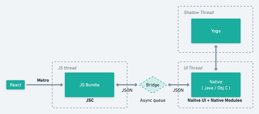 For a better understanding, here is a detailed explanation of the RN internals.
In RN, by default all updates are delayed by at least one frame as the communication between UI and JavaScript thread is asynchronous and UI thread never waits for the JavaScript thread to finish processing events. On top of the lag with JavaScript playing many roles like running react updates, executing app's business logic, processing network requests, etc., it is often the case that events can't be immediately processed thus causing even more significant delays.
To achieve animations that look smooth, we want our UI to render at 60 fps(frames per second). In other words, we need to render 1 frame roughly every 16 milliseconds. If we perform expensive computations that take longer than 16 milliseconds within a single frame, our application may begin to look choppy and uneven. This is where React Native Reanimated v2 comes to the rescue. Reanimated is a React Native library that allows for creating smooth animations and interactions that runs on the UI thread.
For the rest of this post, I'm going to be walking through some of the core APIs of Reanimated 2, and learn how to use them in code. The end result will be a custom slider, and a circular progress that animates as you drag the slider handle.
Setup and Installation
For this project, i will be making a fresh installation of Reanimated in an Expo managed app. I decided to use Expo, because, why not?. To use experimental support of Reanimated 2 in Expo managed apps follow their installation instructions. .
However, If you just want to play with Reanimated 2, there is a clean repo that has all the steps configured so that you can just pull it from github and give the new version a shot.
Visit the Playground repo here or copy the command below to do a git clone:
git clone git@github.com:software-mansion-labs/reanimated-2-playground.git
In the root folder of our project, we will be creating a "src" directory where all our code files will live. Our component structure is going to look something like App > Src > CircularProgress.js + Slider.js where our App component will hold the shared values and pass those down to our CircularProgress and Slider components as props.
Side Note
When working with Reanimated, I know that my animation code must play nicely with both JS code and native code, and that Reanimated will abstract away a lot of the dirty details for me. The Reanimated primitive that does this dirty-detail-abstraction is a worklet.
The ultimate goal of worklets is for them to define small pieces of JavaScript code that we run when updating view properties or reacting to events on the UI thread. According to Reanimated docs, workouts are tiny chunks of JavaScript code that can be moved to a separate JavaScript VM and executed synchronously on the UI thread. Basically, worklets are just JS functions that get executed on the UI thread (magic!) which allows us to define native-level animation commands in JS without worrying about the cost of the bridge. The only thing that is needed is for that JS function to have worklet directive at the top:
function someWorklet(greeting) {
  'worklet';
  console.log("worklet is running on the UI thread");
}
Shared Values
Shared Values are among fundamental concepts behind Reanimated 2.0. If you are familiar with React Native's Animated API you can compare them to Animated.Values. They serve a similar purpose of carrying "animateable" data, providing a notion of reactiveness, and driving animations.
Let's look at a really simple example of creating a shared value:
import * as React from "react";
import { Button, Text, View } from "react-native";
import { useSharedValue } from "react-native-reanimated";

const SharedValue = () => {
  const x = useSharedValue(0);

  return (
    <View>
      <Button title="Increment x" onPress={() => (x.value += 1)} />
    </View>
  );
};
Whenever you hit the button, the shared value gets incremented! This is illustrative of how to create a shared value, but these shared values aren't of much use to us until we actually use them. Let's dig into some tools for actually using our shared values to make our slider.
Making the Slider
Let's finally dig into our code. Create a file (slider.js) inside your src folder (render this component in App.js). To start, we'll just build out the UI and showcase how to use shared values hooks useSharedValues, and another very important hook exposed by Reanimated, useAnimatedStyle, to move our slider's handle around. Reanimated 2 gives us a useAnimatedStyle hook that allows us to animate styles using shared values. Inside this hook, we will define style properties we want to be animated, then we need to pass whatever useAnimatedStyle hook has returned to an Animated component as a style property.
slider.js

import * as React from "react";
import Animated, {
  useAnimatedStyle,
} from "react-native-reanimated";
import { View, StyleSheet } from "react-native";

const HANDLE_WIDTH = 20;

export const Slider = ({ progress, sliderWidth }) => {
  const animatedHandleStyle = useAnimatedStyle(() => {
    return {
      transform: [{ translateX: progress.value - HANDLE_WIDTH / 2 }],
    };
  });

  React.useEffect(() => {
    const interval = setInterval(() => {
      progress.value = Math.random() * sliderWidth.value;
    }, 1000);
    return () => {
      clearInterval(interval);
    };
  }, []);

  return (
  <View style={{ flex: 1, justifyContent: "center", alignItems: "center" }}>
    <View
      style={styles.container}
      onLayout={(e) => {
        sliderWidth.value = e.nativeEvent.layout.width;
      }}
    >
      <Animated.View style={[styles.handle, animatedHandleStyle]} />
    </View>
</View>
  );
};

export default Slider;

const styles = StyleSheet.create({
  container: {
    alignSelf: "center",
    position: "absolute",
    bottom: 80,
    height: 50,
    width: "80%",
    backgroundColor: "grey",
    borderRadius: 10,
  },
  handle: {
    width: HANDLE_WIDTH,
    backgroundColor: "green",
    borderRadius: 10,
    position: "absolute",
    bottom: -20,
    top: -20,
  },
});
And in App.js:
import React from "react";
import { StyleSheet, View } from "react-native";
import Slider from "./src/slider";
import Animated, { useSharedValue } from "react-native-reanimated";

export default function App() {
  const sliderWidth = useSharedValue(0);
  const progress = useSharedValue(0);
  return (
    <View style={styles.container}>
      <Slider sliderWidth={sliderWidth} progress={progress} />
    </View>
  );
}

const styles = StyleSheet.create({
  container: {
    flex: 1,
  },
});
In the code above, we have two shared values, progress and sliderWidth. We'll be primarily focused on progress, but sliderWidth will be used to keep track of the slider's width (which we measure with onLayout). We also created an animated style, animatedHandleStyle,which is responsible for moving our handle around on the slider track.
For demonstration purposes, we just created a useEffect to update the progress shared value every second.
From the result above, we are not really animating. We're just periodically changing the progress value, thus having it move in a choppy manner. let's fix that!
In addition to useSharedValues, Reanimated also gives us some other tools to actually animate our shared values with various easing functions. With functions like withTiming, withSpring, and withDelay we can start to compose smooth animations in a declarative way. You can update a shared value using one of these functions, and that shared value will animate based on your configuration.
You can check out these functions in the docs. Currently, our slider handle is busying jumping around. Let's go ahead and smooth that out. Within our useEffect hook, let us update our progress value.
...
React.useEffect(() => {
    const interval = setInterval(() => {
      /* replace this */
      //progress.value = Math.random() * sliderWidth.value;

      /* with this */
      progress.value = withSpring(Math.random() * sliderWidth.value);
    }, 1000);    return () => {
      clearInterval(interval);
    };
  }, []);
With that, our handle is now smoothly animating to different positions. There are various physics properties we could configure using withSpring function or other exposed functions, this totally depends on what you want to achieve.
Animating with Gestures
Animations alone are almost never enough for modern day mobile applications, most users now expect a certain level of gesture support in mobile applications (think: swipe down to dismiss, drag to reorder, pinch to zoom, etc.). Gestures generally go hand-in-hand with animations because as the user is performing a gesture, the app generally animates some aspect of the UI to provide the user feedback that a gesture is being registered and handled as expected.
Reanimated once again provides us with a useful hook we can use to create gestures, this gesture can then be provided to gesture handler components from the library, react-native-gesture-handle to register our gesture handlers. This combination makes gesture/animation handling quite friendly!
####useAnimatedGestureHandler
Reanimated provides us another important hook, useAnimatedStylenside hook. With this we can define style properties we want to be animated, then we need to pass whatever hook has returned to an Animated component as a style property.
This hook allows us for defining a number of worklets (e.g., onStart or onEnd), each of these will be used to process a different state in the gesture recognition process. In our example, we will use onStart worklet which is called when the gesture is started (we press the slider handle down), and onEnd that fires up when the gesture is ended (i.e., the finger is lifted from the screen). We use these two worklets to update shared value pressed accordingly.
Let's continue our previous slider work, because we want to be in charge of the slider moving, we will replace it with a gesture handler. Then we'll register our gesture handler inside of our JSX via a PanGestureHandler component, with these changes in place, we should have gesture support! We can drag our handle like you'd expect from a slider.. Here's the updated code:
...
import Animated, {
  useAnimatedStyle,
  useSharedValue,
  withSpring,
  useAnimatedGestureHandler,
  runOnJS,
} from "react-native-reanimated";
import { PanGestureHandler } from "react-native-gesture-handler";

...
  const animatedHandleStyle = useAnimatedStyle(() => {
    return {
      transform: [{ translateX: progress.value - HANDLE_WIDTH / 2 }],
    };
  });

const onDraggedSuccess = () => {
    progress.value = withSpring(sliderWidth.value);
    Alert.alert(`dragged to end position: ${Math.floor(progress.value)}`);
  };

  const panGestureHandler = useAnimatedGestureHandler({
    onStart: (_, ctx) => {
      ctx.startProgress = progress.value;
    },
    onActive: (event, ctx) => {
      progress.value = ctx.startProgress + event.translationX;
    },

    onEnd: () => {
      if (progress.value > sliderWidth.value) {
        progress.value = withSpring(sliderWidth.value);
      } else if (progress.value < 0) {
        progress.value = withSpring(0);
      }
    },
  });

  return (
    ...
      <PanGestureHandler onGestureEvent={panGestureHandler}>
        <Animated.View style={[styles.handle, animatedHandleStyle]} />
      </PanGestureHandler>
    </View>
  );
};

export default Slider;
As earlier stated, the useAnimatedGestureHandler hook allow us to configure our gesture handler based on various lifecycle hooks for the gesture. The handler has a context object that we can use to pass information between the different lifecycle methods. Let's check out the lifecycle callbacks of the gesture handler we configured here.
onStart: (_, ctx) => {
      ctx.startProgress = progress.value;
    },
The onStart callback exposes a context object that we can pin information to. In this case, when the user starts to move the handle, we attach the progress value at the start of the pan to the context object. Other than attaching this progress value to the context, we're not doing anything when the user starts the pan.
onActive: (event, ctx) => {
      progress.value = ctx.startProgress + event.translationX;
    },
Next, we have the onActive callback which is called as the user is actively moving the handle. As the onStart callback, onActive callback exposes an event object. The event object will tell us how much the user has moved since the start via the event.translationX property. To determine the new progress value, we take the starting progress value and add it to the amount by which the handle's horizontal position has changed. Easy, right?. This is technically all we need for our slider handle to move according to our pan gesture!
We're added a little bit of spice to this, though. Notice how if we drag the handle past the slider track, it'll spring back, then alert us with the progress value? We configured that with the onEnd callback. First, we need to wrap our function with the runOnJS method, then we call the runOnJS method and pass in the onDragSuccess function. If we forget about wrapping our Javascript callback, Reanimated 2 will inform us about that fact by displaying an appropriate error. You can read more about runOnJS here.
onEnd: () => {
 if (progress.value > sliderWidth.value) {
        runOnJS(onDraggedSuccess)();
        progress.value = withSpring(sliderWidth.value);
      } else if (progress.value < 0) {
        progress.value = withSpring(0);
      }
},
Animating Layout Properties
View styles are definitely the most frequently animated properties out there. However, in some usecases it is important to also animate properties that do not belong to styles. Thankfully, Reanimated allows for that, but as the properties do not belong to styles we can't just use the useAnimatedStyle hook. For this purpose Reanimated exposes a separate hook called useAnimatedProps. It works in a very similar way to useAnimatedStyle, but instead of expecting a method that returns the animated styles, we expect the returned object to contain properties that we want to animate. Then, in order to hook animated props to a view, we provide the resulting object as animatedProps property to the "Animated" version of the view type we want to render.
Animating Text Display
To better understand how to animate the text display, we will add a "circular progress" display to our app. This circular progress component is going to need access to the shared values we've already defined (progress and sliderWidth), so we pass them in from the slider component.
slider.js
...
<View style={{ flex: 1, justifyContent: "center", alignItems: "center" }}>
      <CircularProgress sliderWidth={sliderWidth} progress={progress} />
      <View
        style={styles.container}
        onLayout={(e) => {
          sliderWidth.value = e.nativeEvent.layout.width;
        }}
      >
...
We will start our CircularProgress component by creating some text that represents the percentage of the handle progress along the slider track. We will use a disabled TextInput component, and animate its text prop, this should create a nice animation. By default, RN's TextInput component isn't animatable, so we need to make it animatable using Reanimated's createAnimatedComponent method which allows us to pass animated props or styles to a component. Let's see some code:
CircularProgress.js

import * as React from "react";
import Animated, {
  interpolateColor,
  useAnimatedProps,
} from "react-native-reanimated";
import { Circle } from "react-native-svg";
import { StyleSheet, TextInput, View } from "react-native";
import { clamp } from "./clamp";

const AnimatedInput = Animated.createAnimatedComponent(TextInput);

export const CircularProgress = ({ progress, sliderWidth }) => {
  const radius = 70;
  const animatedInputProps = useAnimatedProps(() => {
    const percentComplete = clamp(progress.value / sliderWidth.value, 0, 1);
    return {
      text: `${Math.round(100 * percentComplete)} %`,
      color: interpolateColor(
        percentComplete,
        [0, 0.5, 1],
        ["red", "yellow", "green"]
      ),
    };
  });

  return (
    <View>
      <View style={{ width: radius * 2, height: radius * 2 }}>
        <AnimatedInput
          editable={false}
          defaultValue="0"
          style={[
            StyleSheet.absoluteFill,
            {
              fontSize: radius / 2,
              fontWeight: "500",
              textAlign: "center",
              textShadowColor: "black",
              textShadowOffset: { width: 2, height: 2 },
              textShadowRadius: 4,
            },
          ]}
          animatedProps={animatedInputProps}
        />
      </View>
    </View>
  );
};

export default CircularProgress;

const styles = StyleSheet.create({
  container: {
    flex: 1,
  },
});
First, we created an animatable TextInput component by passing the traditional TextInput from RN into the createAnimatedComponent method.
const AnimatedInput = Animated.createAnimatedComponent(TextInput);
Next we animate the props. Remember when we talked about worklets? Here we will create a simple 'clamp' worklet. It's only function is to clamp a given value between two other values(ie: 'clamp' our percentComplete between 0 and 1)
clamp.js
export const clamp = (x, min, max) => {
  "worklet";
  if (x < min) return min;
  if (x > max) return max;
  return x;
};
Next, we animate the text and color property based on the percentageComplete. With the help of an interpolateColor function, we are able to animate the color (either red, yellow, or green) of the TextInput based on the percentage. Once we've created some animated props, we just need to pass those to our animated component:
<AnimatedInput
          editable={false}
          defaultValue="0"
          ...
          animatedProps={animatedInputProps}
        />
If you got to this point, then you should have a custom slider, and a number-display that represents our slider handle's progress. We will polish this animation off with a "circular progress" indicator—something that looks like the stroke of a circle being drawn around it. We make use of an SVG circle and tweak its strokeDasharray and strokeDashoffset to create the look we're going for.
The strokeDasharray property of an SVG path represents the "dash pattern" of its stroke. If we set the strokeDasharray of the element to CIRCUMFERENCE, it means we'll have one dash that wraps around the whole circle.
The strokeDashoffset property of an SVG path represents the offset of the "dash pattern" of its stroke, so a strokeDashoffset of 5 makes the "dash pattern" of the stroke start 5 units later than it normally would. If we animate this strokeDashoffset property, we can make it appear like our circle's stroke is drawing out the perimeter of the circle.
Learn more about SVG
Talk is cheap, show me some code:
CircleProgress.js

import * as React from "react";
import Animated, {
  interpolateColor,
  useAnimatedProps,
  interpolate,
} from "react-native-reanimated";
import { Circle, Svg, G } from "react-native-svg";
import { StyleSheet, TextInput, View } from "react-native";
import { clamp } from "./clamp";

...
const AnimatedCircle = Animated.createAnimatedComponent(Circle);

export const CircularProgress = ({ progress, sliderWidth }) => {
  ...
  const CIRCUMFERENCE = 2 * Math.PI * radius;
  const HALF_WIDTH = radius + strokeWidth;
  const animatedBgProps = useAnimatedProps(() => {
    const percentComplete = clamp(progress.value / sliderWidth.value, 0, 1);
    return {
      fillOpacity: interpolate(percentComplete, [0, 1], [0.2, 0.75]),
    };
  });

  const animatedProgressProps = useAnimatedProps(() => {
    const percentComplete = clamp(progress.value / sliderWidth.value, 0, 1);
    return {
      strokeDashoffset: (1 - percentComplete) * CIRCUMFERENCE,
    };
  });

  const animatedInputProps = useAnimatedProps(() => {...});

  return (
    <View>
      <View style={{ width: radius * 2, height: radius * 2 }}>
        <Svg
          width={radius * 2}
          height={radius * 2}
          viewBox={`${-HALF_WIDTH} ${-HALF_WIDTH} ${2 * HALF_WIDTH} ${
            2 * HALF_WIDTH
          }`}
        >
          <G rotation="-90">
            <AnimatedCircle
              cx={0}
              cy={0}
              r={radius}
              fill="transparent"
              strokeWidth={strokeWidth}
              strokeLinecap="round"
              strokeDasharray={CIRCUMFERENCE}
              animatedProps={animatedProgressProps}
              stroke={"blue"}
            />
            <AnimatedCircle
              cx={0}
              cy={0}
              r={radius}
              stroke="rgb(180,180,180)"
              strokeWidth={2}
              strokeLinejoin="round"
              strokeOpacity="0.1"
              animatedProps={animatedBgProps}
              fill={"black"}
            />
          </G>
        </Svg>

        <AnimatedInput
          editable={false}
          defaultValue="0"
          style={[
            StyleSheet.absoluteFill,
            {
              fontSize: 50 / 2,
              fontWeight: "500",
              textAlign: "center",
              textShadowColor: "black",
              textShadowOffset: { width: 2, height: 2 },
              textShadowRadius: 4,
            },
          ]}
          animatedProps={animatedInputProps}
        />
      </View>
    </View>
  );
};
export default CircularProgress;
First we determined the circumference of the circle we'll be creating,
const CIRCUMFERENCE = 2 * Math.PI * radius;. Then we create an animated SVG circle, and pass some props, including a strokeDasharray with a value of the circumference of the circle.
<AnimatedCircle
  strokeDasharray={CIRCUMFERENCE}
  {...otherProps}
/>
We also need to animate the strokeDashoffset to make it appear like our stroke is being drawn around the circle. We'll once again use our friend useAnimatedProps to do this!
const animatedProgressProps = useAnimatedProps(() => {
  const percentComplete = clamp(progress.value / sliderWidth.value, 0, 1);
  return {
    strokeDashoffset: (1 - percentComplete) * CIRCUMFERENCE,
  };
});
Finally, a tiny bit of flavor to our circular progress indicator, add a background whose opacity animates as the progress value changes. All we'll do is add another animatable SVG circle, and animate its fillOpacity prop!
const animatedBackgroundProps = useAnimatedProps(() => {
    const percentComplete = clamp(progress.value / sliderWidth.value, 0, 1);
    return {
      fillOpacity: interpolate(percentComplete, [0, 1], [0.2, 0.75]),
    };
  });
return(
...
<AnimatedCircle
              cx={0}
              cy={0}
              r={radius}
              stroke="rgb(180,180,180)"
              strokeWidth={2}
              strokeLinejoin="round"
              strokeOpacity="0.1"
              animatedProps={animatedBackgroundProps}
              fill={"black"}
            />
...
)
And that is it! You can also find the entire code on GitHub.
Conclusion
In this post, we discussed some core concepts in Reanimated 2 and embarked on a journey to create a little app that showcases some of these concepts and tools it provides. While this example app wasn't terribly useful, it does showcase some useful animation and gesture techniques, and how those can be applied with Reanimated 2.
To start writing code with the new Reanimated 2 API, you don’t need to have prior experience with react-native-reanimated library. The library offers us the powerful API to create eye-catching and effective animations. Reanimated 2 is in an early version, the library still has some rough edges and limitations that they plan to address soon. In my opinion, Reanimated 2 will be setting new trends and will be the first choice by React Native developers when it comes to choosing a library for building animations.
By reading this article, you’ve gained some practical knowledge about how you can use the new Reanimated 2 API. I hope you’ve enjoyed reading this.
If you need to reach out, you can find me on twitter. Cheers!!